Retro Identity: Hardwood Edition
-
PROBLEM STATEMENT
The major issue which I found through my research and analysing each teams logos from the past to the present and also jersey designs, Court designs and other visuals is that teams are adopting a more modern look to their logos by focusing on shaping their logos to be in a circular form rather than adapt to their own previous visual identity.
-
RESEARCH QUESTION
“Why has modernization impacted the NBA and why does it reconsider the way we view the game”
-
SOLUTION
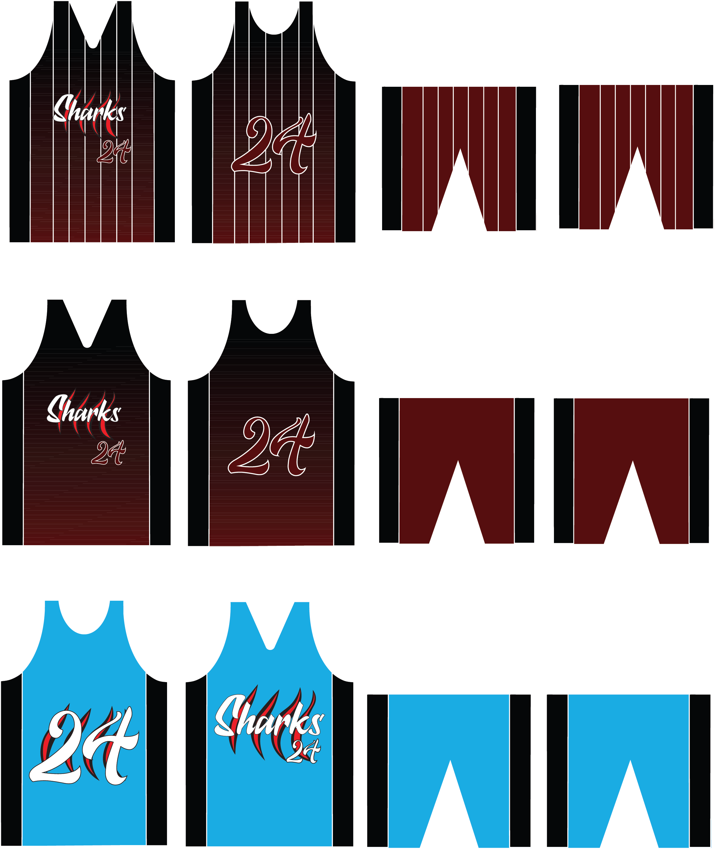
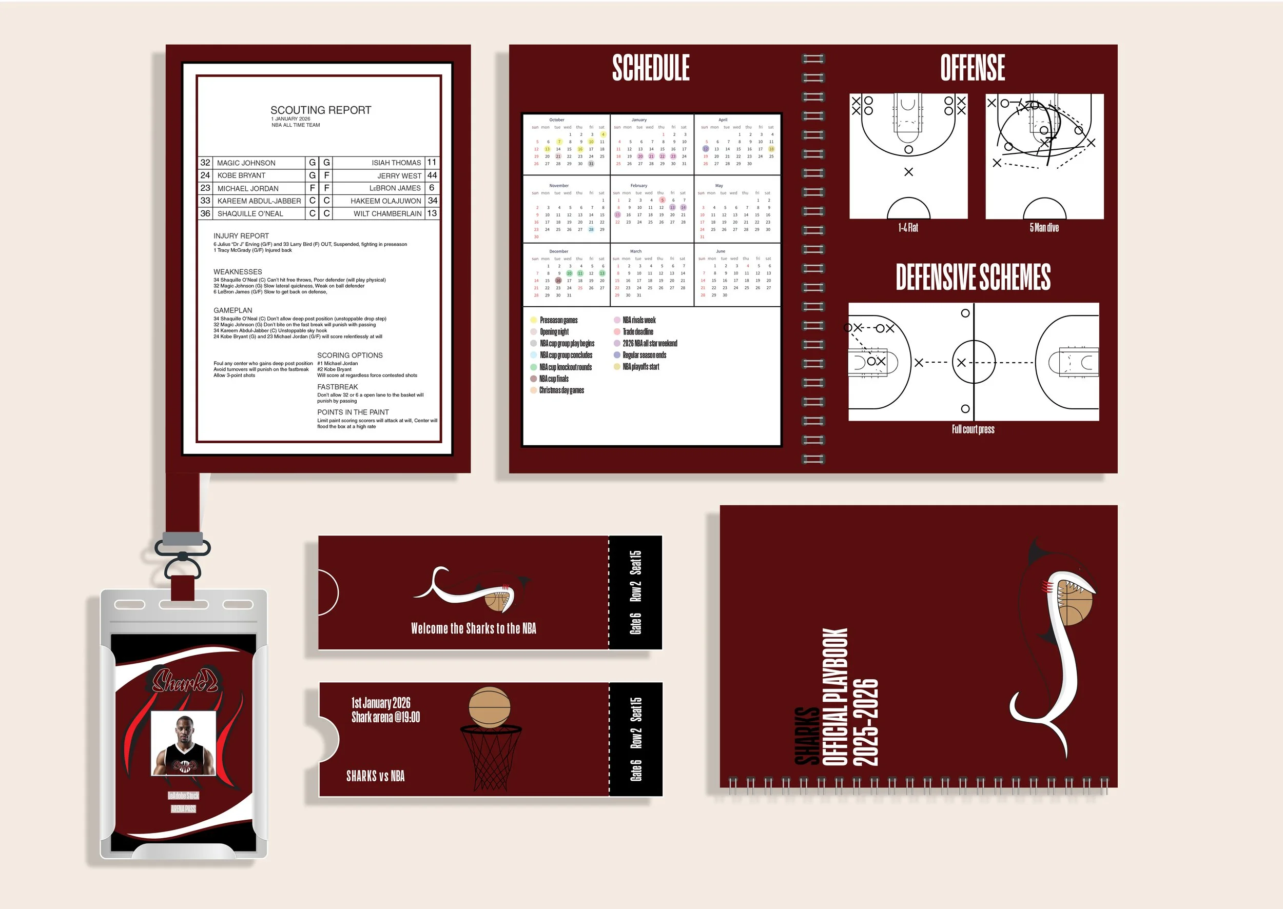
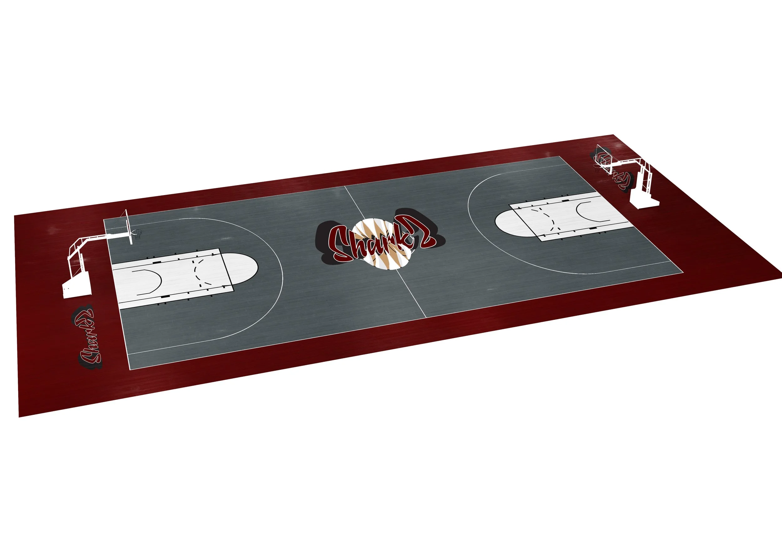
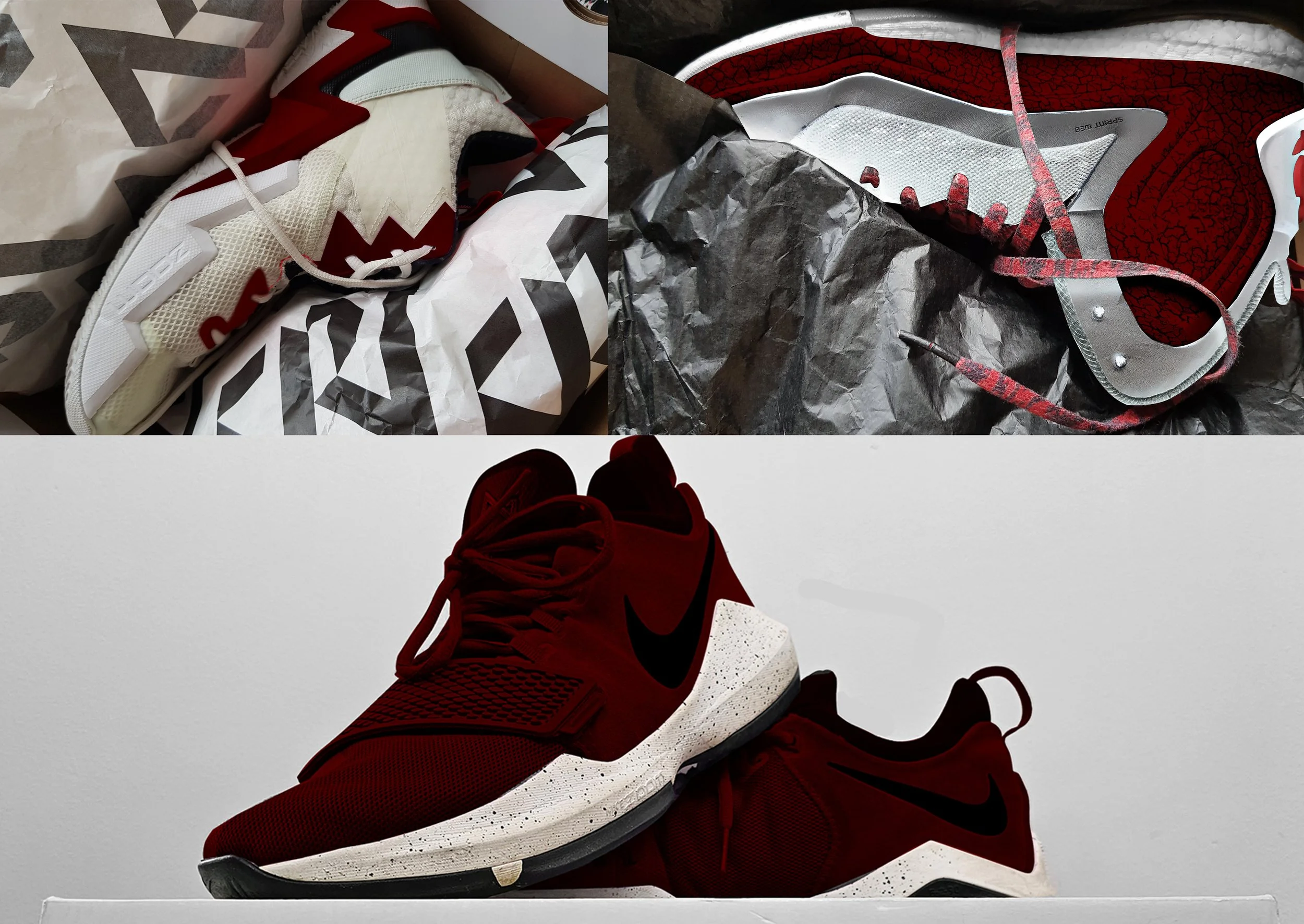
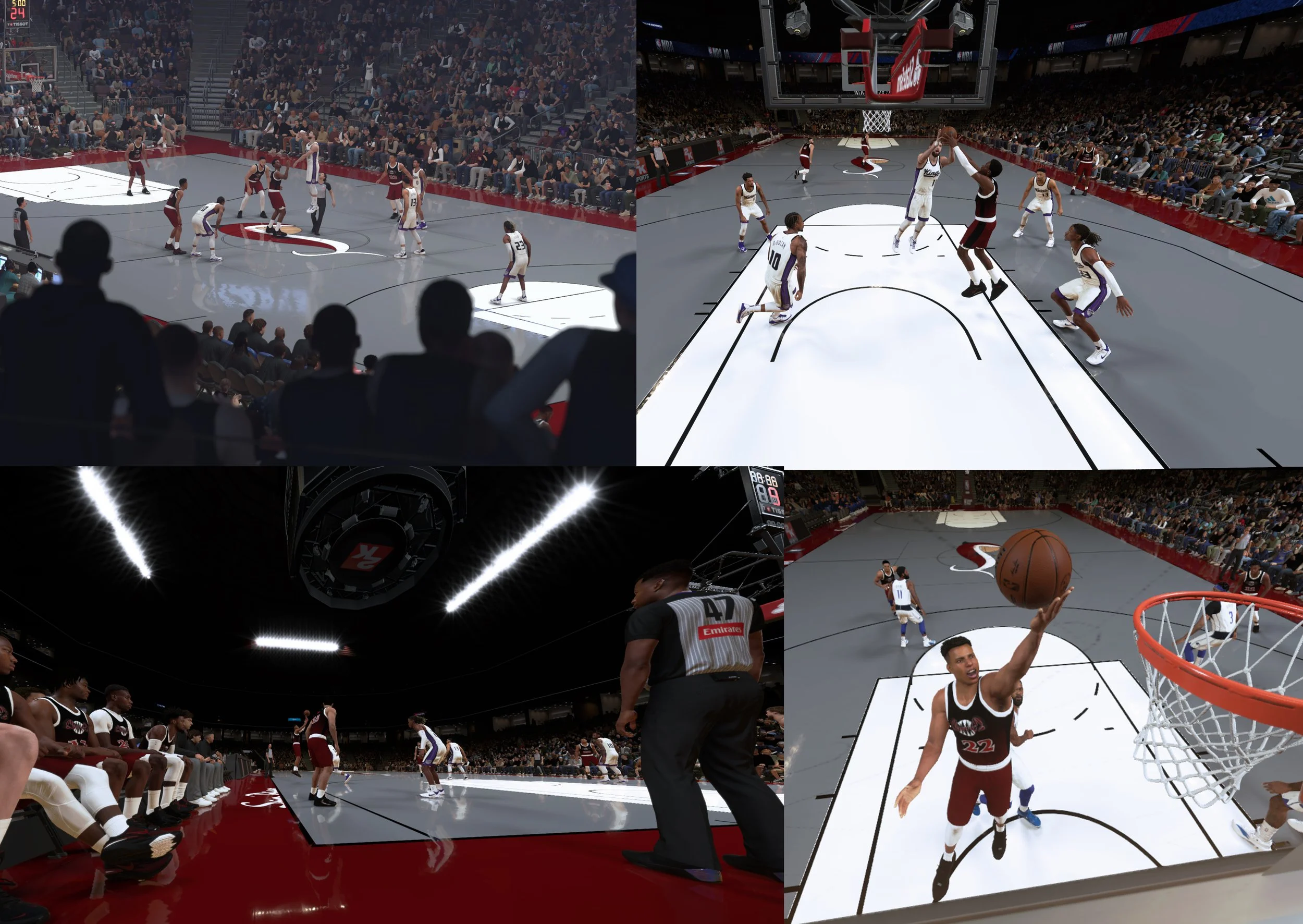
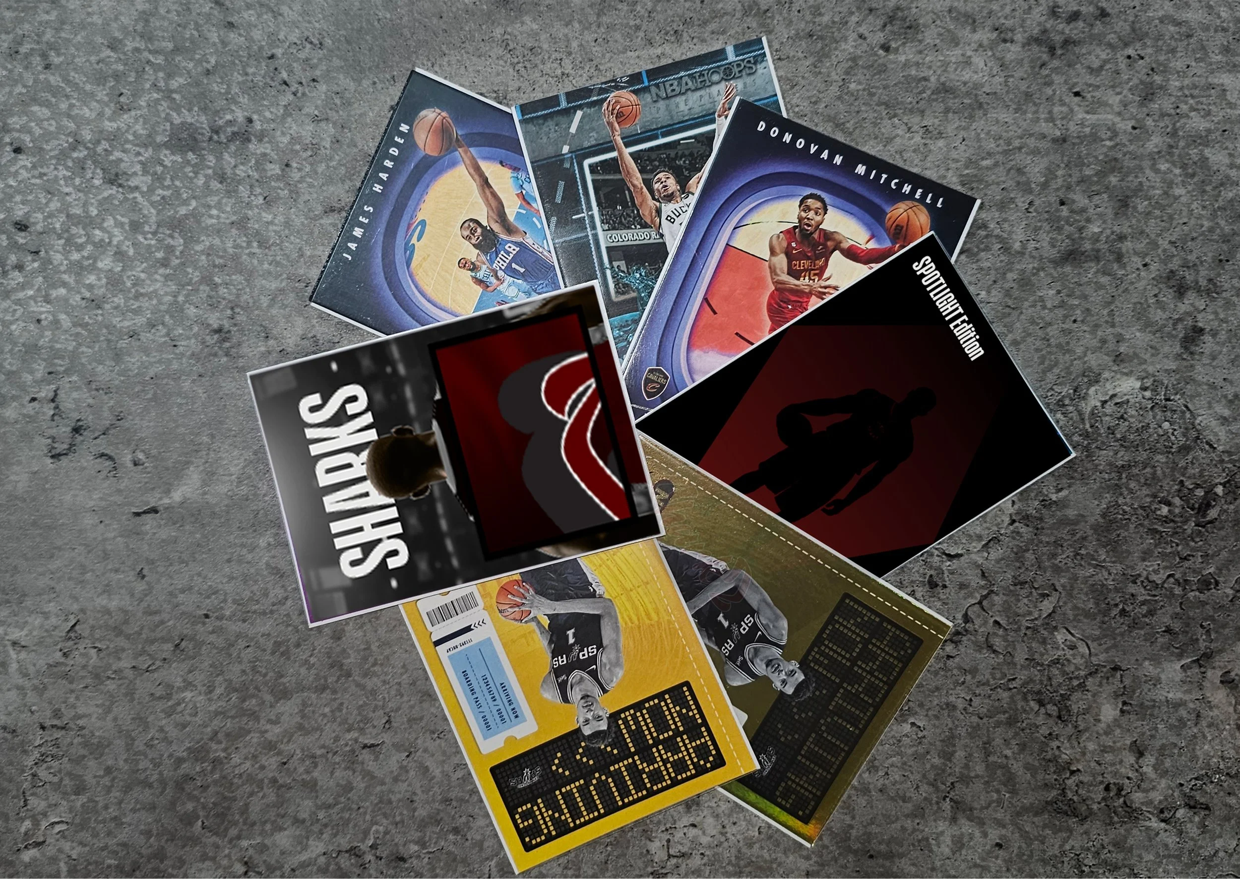
The solution I’ve come up with is to design a new team which has a realistic possibility of joining the NBA. By creating a unique logo which has the essence of past logos. This will involve finding a suitable location which can help create a brand.

Sketches
As part of the sketching process I reflected on my logo analysis to find consistent themes throughout logos. While this was an important part of the sketching process I’ve also looked into how feasible it would be for my design to become reality by targeting teams and locations where teams existed before or major cities where rumors have been emerging.
I first started off reviving the names of previous teams as a reference point to what a team’s logo could look like. The first page of sketches represents the tower being an example when referring to my previous research into teams utilizing their landmarks. While this could’ve been an easy route there are too many design concepts for teams which existed.

Sketches
The 2nd set of sketches represent my imagination of what the visual identity of a new NBA team could look like. While referencing my research I looked to adapt different ideas which could correlate to the visual identity of the past while also having some sort of reference in team location.