
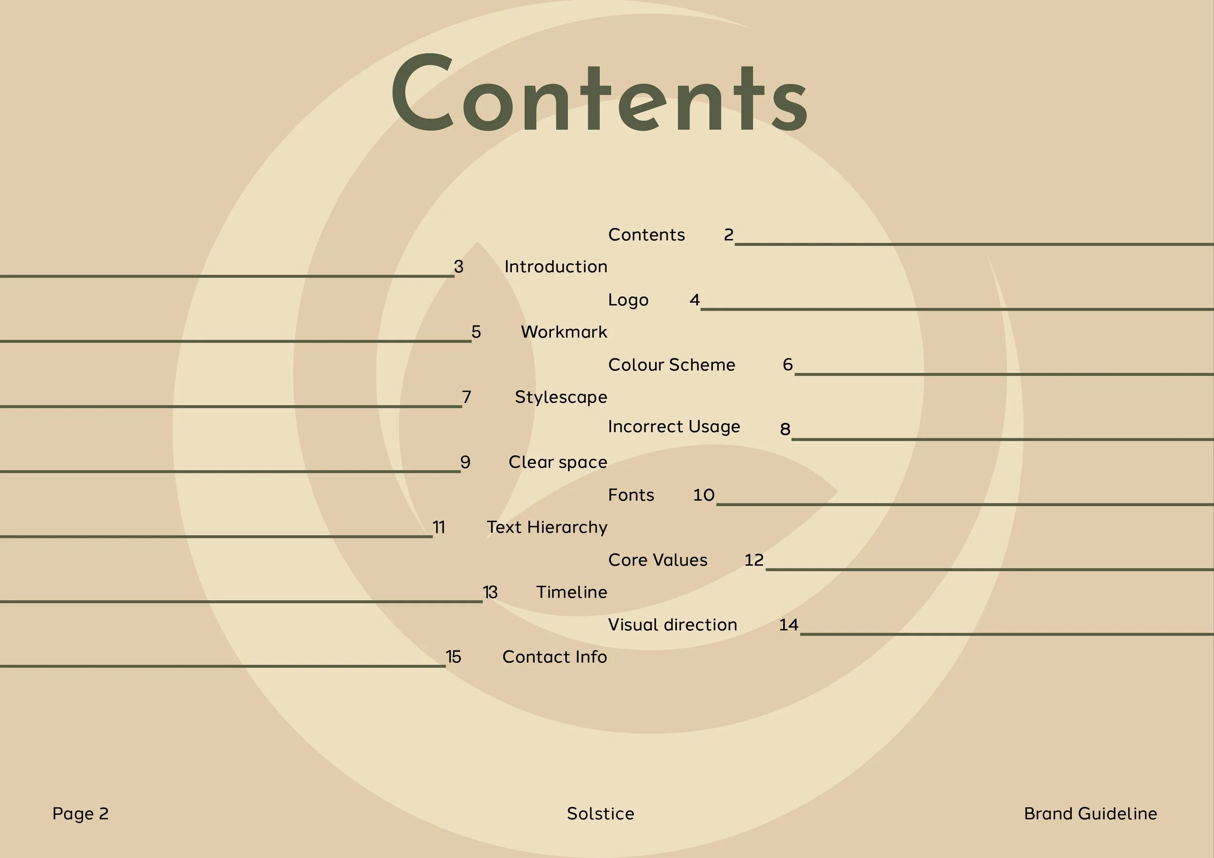
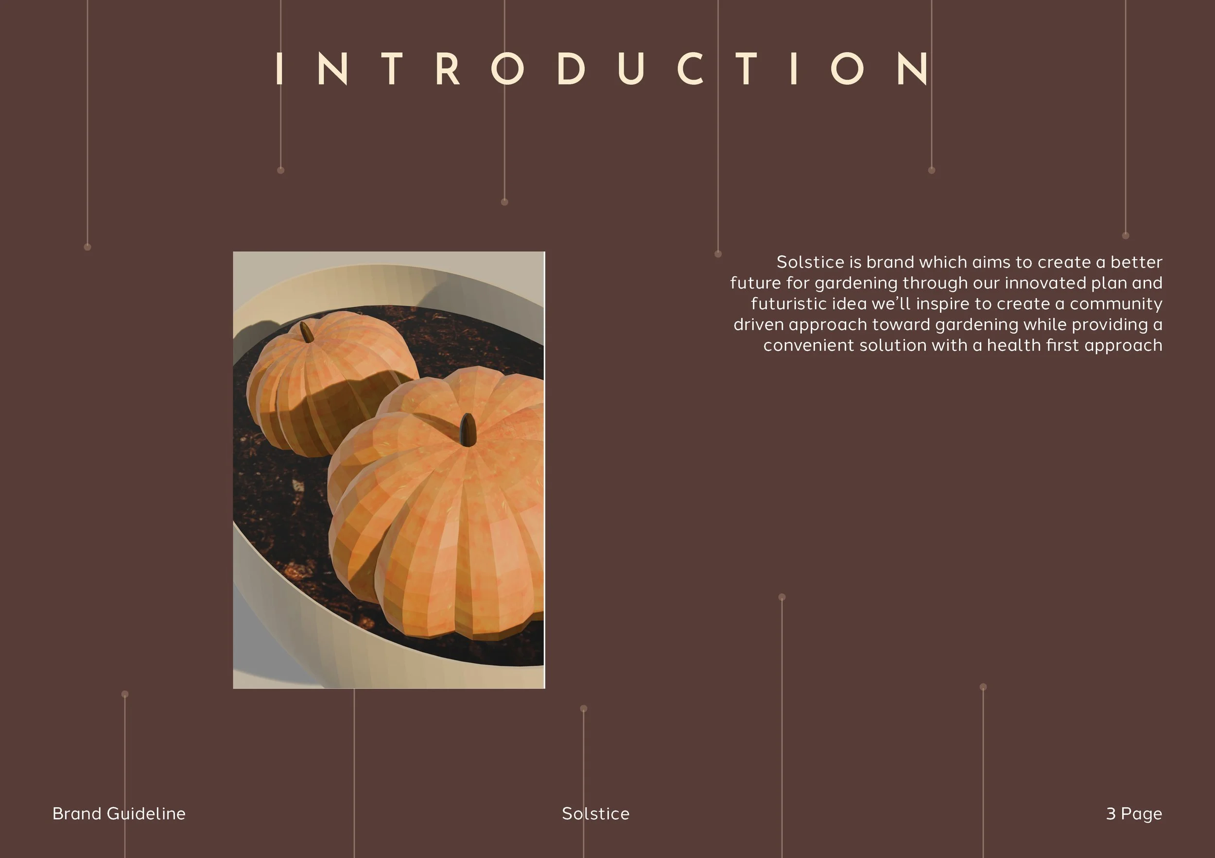
Solstice
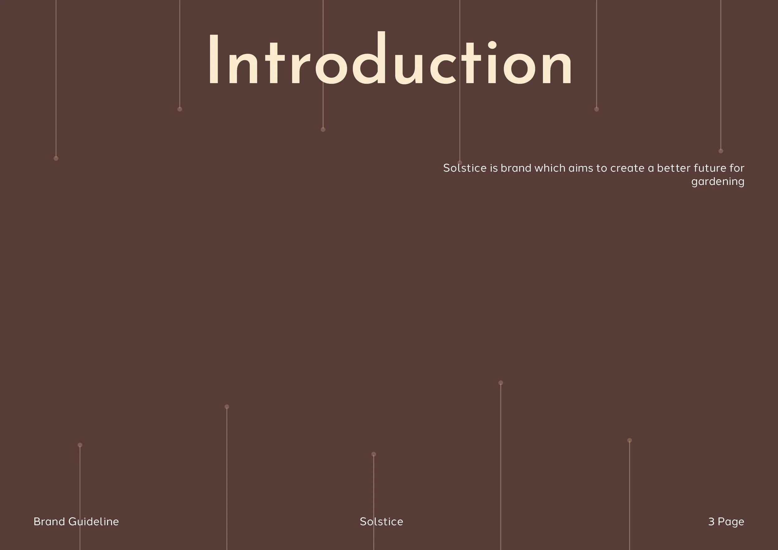
Solstice was a group based project which focused on creating a future proof outcome for sustaining gardening in the year 2050. My task was to create a futuristic product which replaces the typical seed packets we see in the current time period
The Process
It all begins with an idea. Maybe you want to launch a business. Maybe you want to turn a hobby into something more. Or maybe you have a creative project to share with the world. Whatever it is, the way you tell your story online can make all the difference.
Sketches

My initial ideation began with moodboard which then moved to stretching and using reference images there was a consistency between a 3D hexagon shape and futurism
Shape building
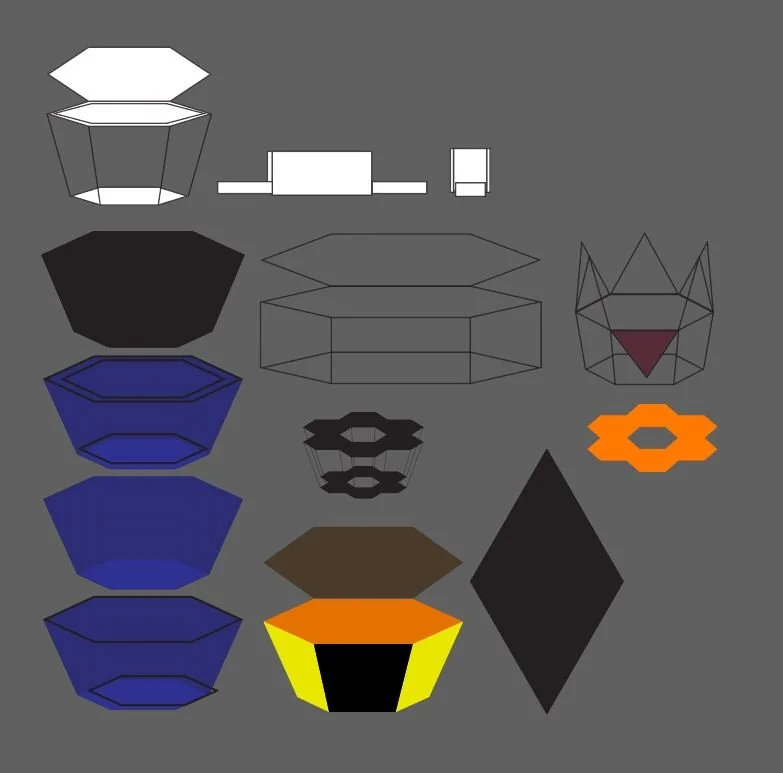
My next step involving bring what sketched into a 3D form using shapes and outlines in illustrator to her a better idea of how id 3D model the object with different variations of how the object can be interacted with such as how it opens and closes.
When it came to 3D modeling of the design I decided to keep the consistency with the hexagon but experimented with other shapes. Through these steps I received group input which helped me understand what the rest of the members of the group is looking for.
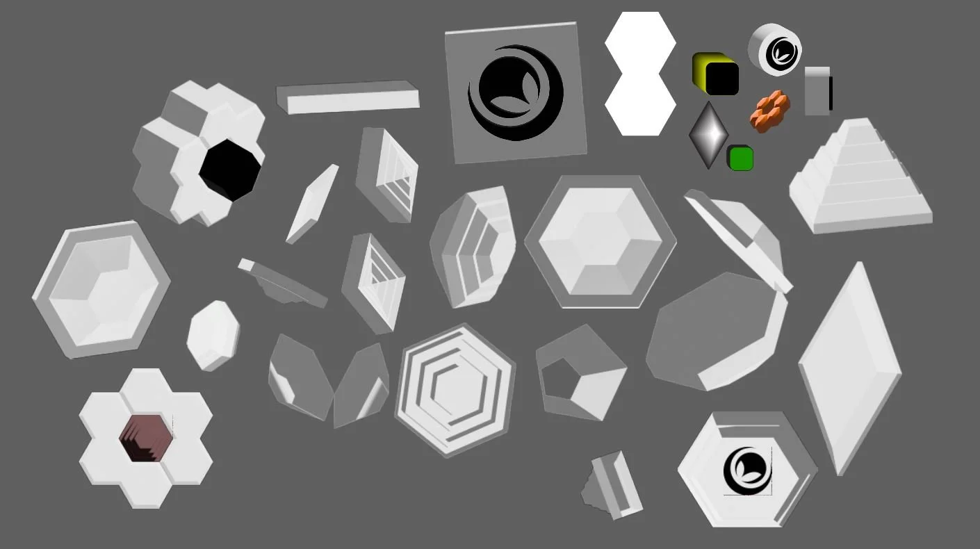
3D Modeling
Refinement

After group input and also refinement I narrowed down to 4 models which were the ideal outcome for what we needed as group. With consistency throughout the project being focused on the 2 hexagon shaped objects as the final outcome and being refined even more to meet the end requirement of being a futuristic seed packet.
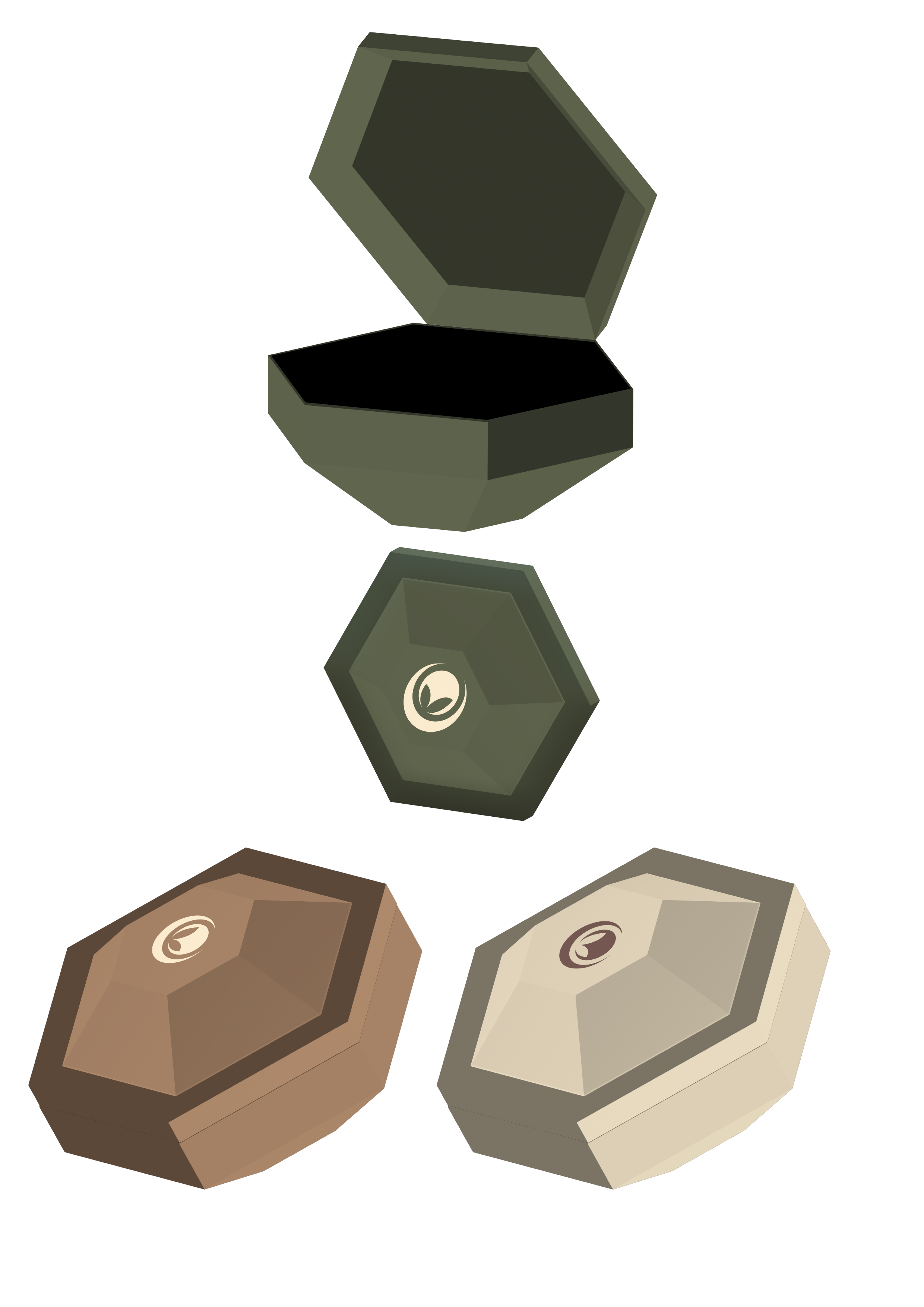
Final Outcome
The final outcome involved implementing the colour scheme into the design and other small details. While adding the projects logos and creating different mockups in a futuristic setting.


Brand guideline
Concept
Refinement
Concept
Throughout the process of creating the brand guideline for solstice the concept phase involved bring together different elements of the brand guideline while moderately working on the visual identity and putting together the brand guideline with each element. The next step involved refining the brand guidelines layout and also adapting the projects visual identity into the design with the colour scheme being more present and visible while also fixing up the details such as how the brand guideline is structured. The final outcome involved minor tweaks with 1 colour being present throughout each page to give it a more consistent feel while also being adjusted to take into consideration how someone would appeal to looking at the guideline based of it being only 1 solid colour rather than having a yellow stick out with a darker toned red which was the main takeaway from the refinement process